Behr.com
Role
Lead UX Designer
The Ask
We were tasked with modernizing Behr.com’s website and reimagining how people shop for paint online.
Note: this is an unfinished case study video.
Process
To ensure we were maximizing on time, we had a brand designer take a look at typography styles and color to create a web style guide in parallel with exploring ways to improve the overall usability of the website.
Without changing too much of the core website, we narrowed down the core areas to focus on. With the new style guide, Behr would be equipped with tools to further evolve their website by standardizing their design system. Most importantly, we were optimizing the mobile responsive layout.
The core areas we redesigned:
- Navigation
- Product Category Page
- Brand Category Page (Parent PDP)
- Product Detail Page (Child PDP, or variant of Parent PDP)
- ColorSmart
- The Visualiser
- Cart
ColorSmart
ColorSmart allows users to browse all of the available Behr colors in a grid format, traditionally grouped by curated collections or search. In our new version, we provided users multiple ways to browse. While Behr has over 1,400 colors to choose from, they are all created by experts based on trends so finding the right one can be a challenge.
1. Browse with a color dropper
This was for the advanced interior expert who wants to pinpoint a specific color. We took a look at how design tools provided the ability for users to pick a hue. We simplified it with a color wheel and a saturation/brightness slider that functioned much like a search tool.
The “paint chip” data updates in real time as the user searches for their color, which was prototyped in a live build by our developer. In tapping the ‘View Detail’ link, the user can save the color and preview it in Visualiser or add it to their cart. In tapping the ‘See All Close Matches’ button, they can see similar colors.

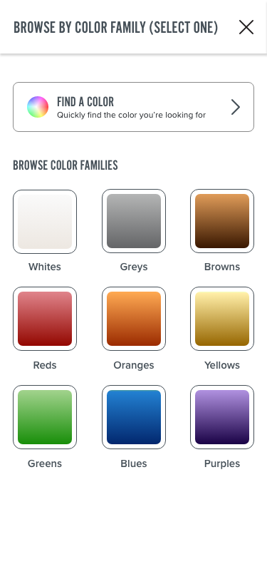
2. Browse by color families
This was what a majority of our user testers looked for. When they are looking for a color, they want to narrow it down to the base or primary color that is closest to the one they have in mind, and then diplay all of their chosen hue in a grid.
While most of our testers searched colors this way, our hypothesis is that the new generation of Behr customers are becoming more and more familiar with advanced design tools like this. We left it up to Behr to decide whether they would like to invest in the advanced tool, or stick to something simpler like Color Family collections.
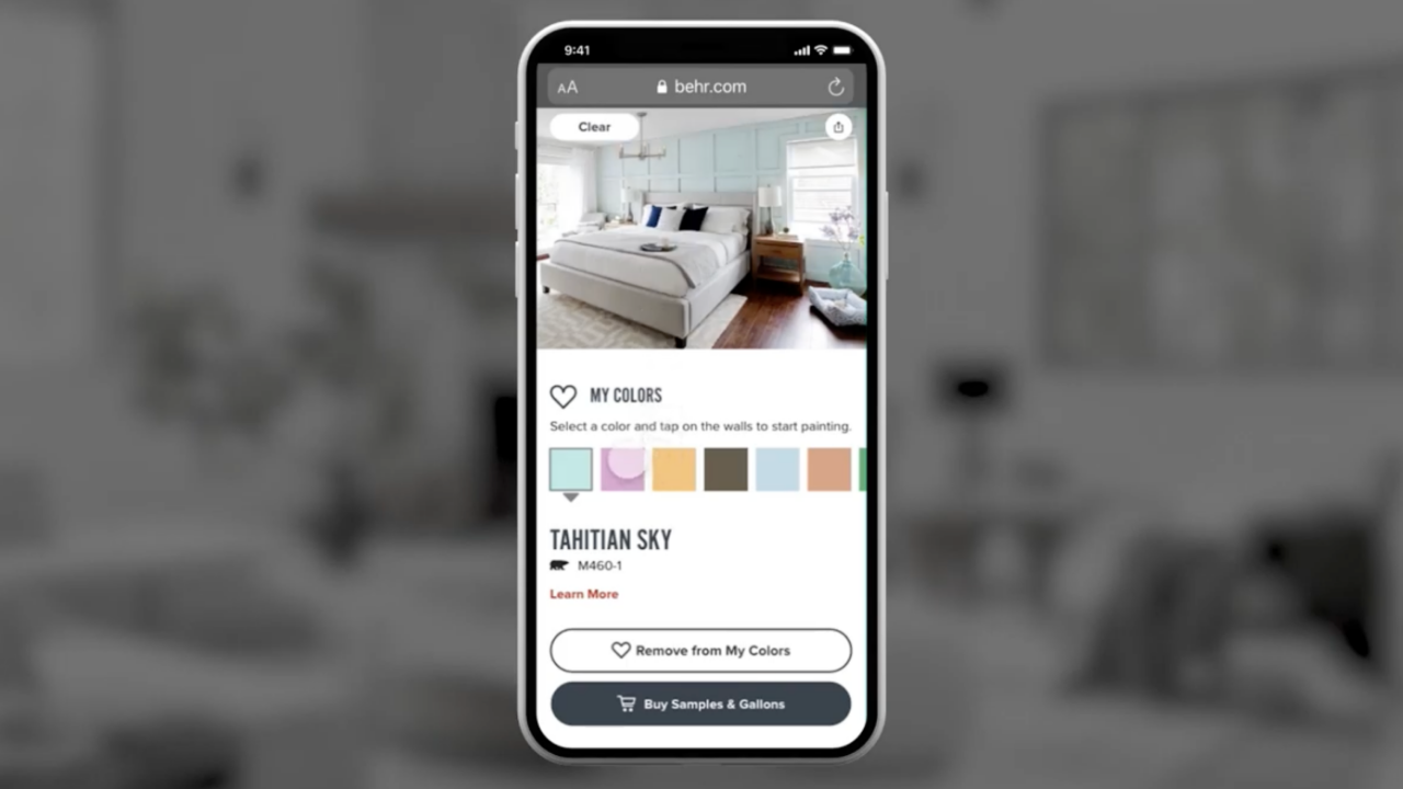
Visualizer
This tool allows the user to see paint colors on a photo of a real room. Users can tap on walls to preview the colors.
Our main goal with redesigning this tool was not to restructure it entirely, but to improve its usability for both web and mobile, and bring the UI up to date with our new style guide.
Our user test subjects really liked this feature, so we invested a lot of time in building out a robust prototype for testing in order to improve on pain points.
Other Notable Features
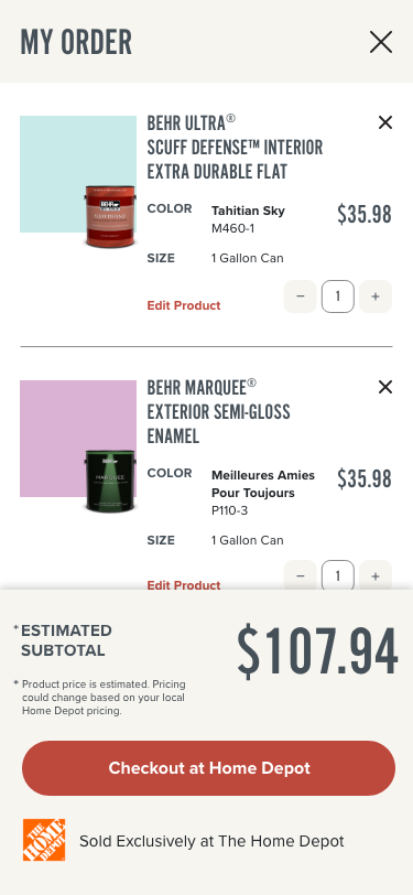
1. My Order
Behr is sold exclusively at Home Depot. My Order functions much like a traditional ecommerce cart, but calling it a “cart” would set the user up with a false expectation. From here, the user taps the “Checkout at Home Depot” button to send the order to HomeDepot.com. There the products will show up in the cart and can be purchased either online or in store. In some cases, users may just use this list and show it to a Home Depot paint specialist to quickly get what they need.
Behr is sold exclusively at Home Depot. My Order functions much like a traditional ecommerce cart, but calling it a “cart” would set the user up with a false expectation. From here, the user taps the “Checkout at Home Depot” button to send the order to HomeDepot.com. There the products will show up in the cart and can be purchased either online or in store. In some cases, users may just use this list and show it to a Home Depot paint specialist to quickly get what they need.
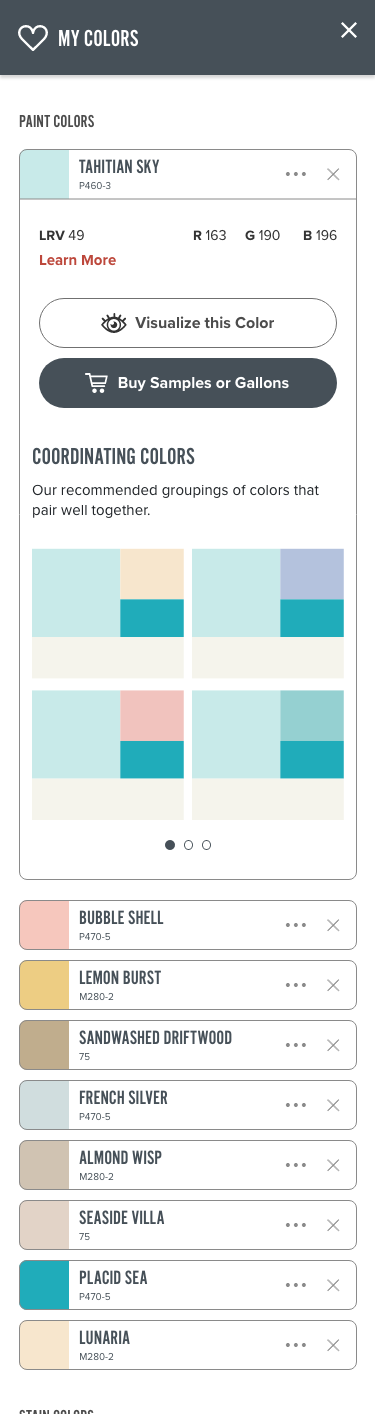
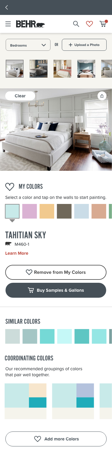
2. My Colors
Saving colors is huge for users to be able to browse and marinate on what they really want. We updated the colors to display as mini paint chip components that expand to display more detailed information.
Saving colors is huge for users to be able to browse and marinate on what they really want. We updated the colors to display as mini paint chip components that expand to display more detailed information.
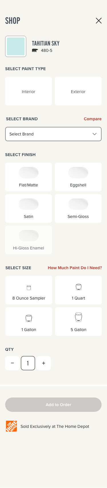
3. Color Detail Drawer & The Shop Drawer
Colors are products in the Behr world. We maintained all the existing components and applied the new style guide with some light reorganization.
Each Color Detail Drawer(left thumbnail) contains unique images of the color in situ, ability to share, similar colors, coordinating colors, social posts, and an area where the user can customize their color to paint type, sheen, size, etc.
The Shop Drawer is just another way that users can access customizations for their selected color. This format is necessary when the user is accessing it from the explicit “Buy Samples & Gallons” CTA that appears across the website, because the user is most likely ready to purchase at this point (this decision was based on data from Behr).

User Testing
We conducted 4 total days of user testing, split into 2 rounds. We tested with about 20 people over Zoom with clickable prototypes. In these interviews, we were able to peek into the customer’s mindset when it comes to buying paint. 100% of our testers liked the enhancements and explorations we presented them, with most of the challenges being centered around the commerce aspect and wayfinding.
Key Observations for Future Enhancements
- Most users expressed that they would like to be able to reorder the paint colors within the “My Colors” list.
- Some users expressed a desire to be able to organize their colors by “room” or “projects” that they could define themselves.
- Some users wanted to be able to organize the photos they uploaded to Visualizer into project groupings.
- Some users wanted the ability to compare colors they had saved next to one another.
- Some users asked for the ability to apply the total recommended in the Coverage Calculator to the shopping module.