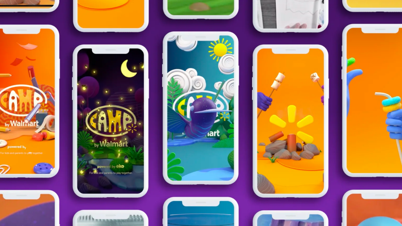
Camp by Walmart
Role
UX Designer
UX Designer
Year
2020
2020
Overview
Camp by Walmart is an experience designed for the Internet. The free virtual camp, where celebrities are the counselors, is powered by the interactive video platform Eko, in which Walmart Inc. is an investor. With 100 interactive episodes that lead to 150 activities families can do at home, Walmart sees this as a content hub and the only place that you can access Camp seamlessly integrated play moments with products.
Walmart partnered with interactive video content platform Eko and family experience company Camp to create a shoppable summer camp experience in the Walmart app.
Press
- “Camp Is In Session After All, Only It’s Virtual, At Camp By Walmart” — Forbes
- “Amazon, Apple, Walmart are offering virtual summer camp programs for kids”— USA Today
- Best of Behance
Research & Development
We began ideating for Camp by Walmart in March 2020, right when the pandemic hit the country. In just 3 months, Camp by Walmart was developed and delivered in the “new reality” of families needing new ways to entertain and educate their children at home.
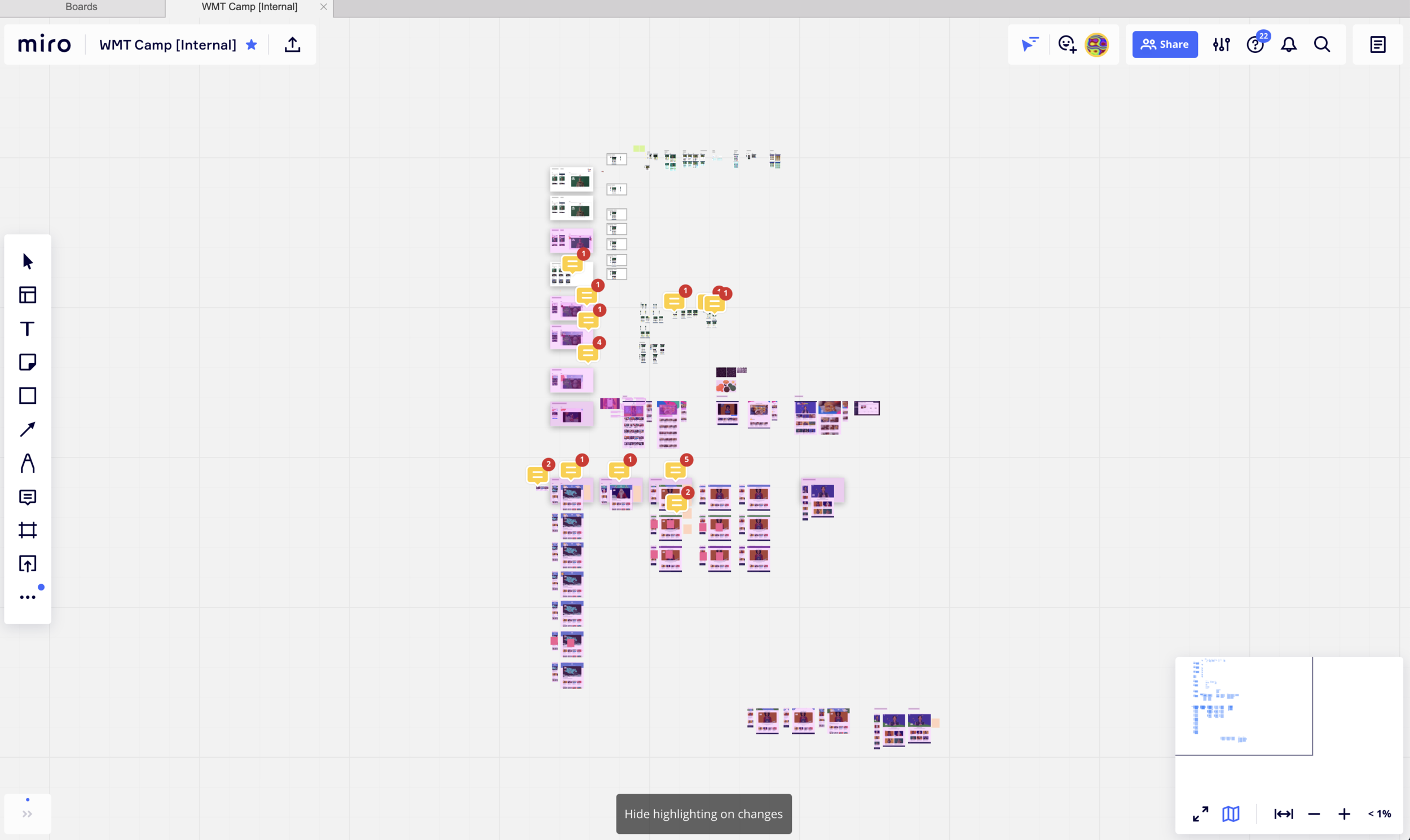
While browsing news articles, I discovered Miro, a virtual whiteboard where users can remotely collaborate. In conjunction with Zoom, our team was able to work closely together. This process really evolved our workstream, and was the catalyst for improving collaboration company-wide. Eventually, we invited external teams and clients to check out our Miro boards (anyone can view them in a browser) and become involved in the development. It allowed us to receive feedback in real-time, which was crucial to the success of this project.
 Work in progress
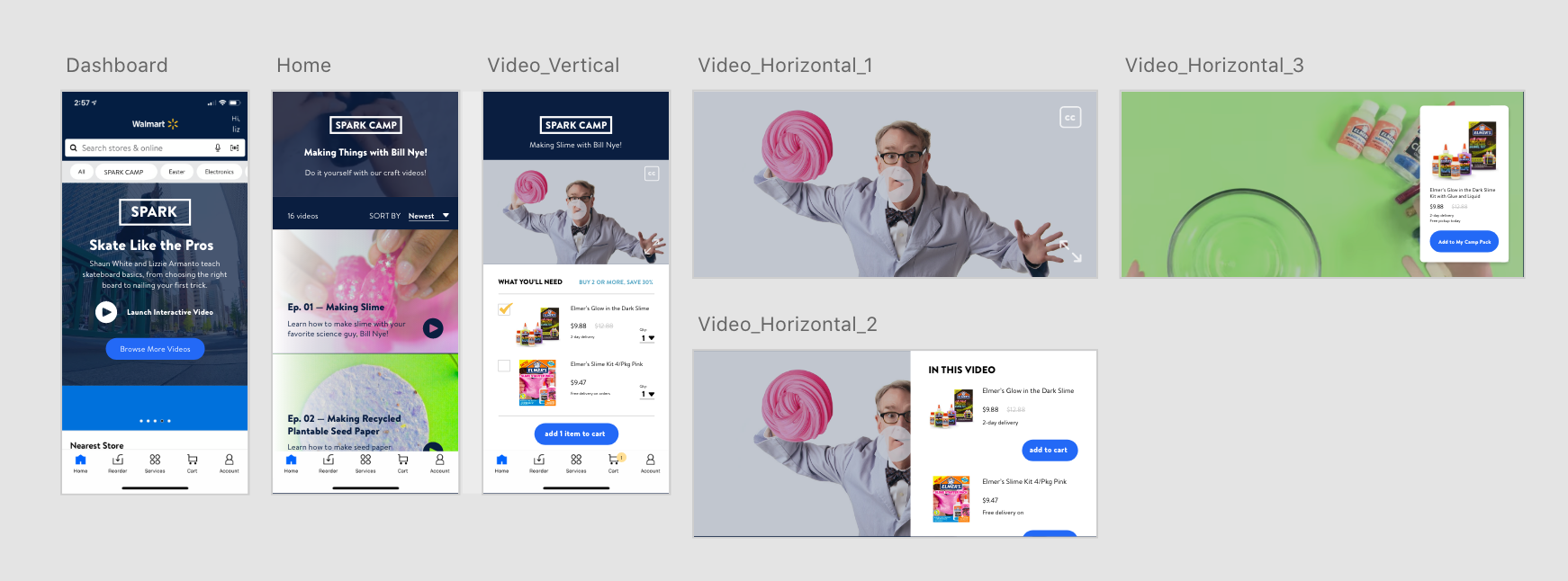
High-Fidelity Wireframes
Every project has its hurdles; time is often one of them. Since Eko already had the interactive video product, our job was the integrate Eko into the Walmart app/website, integrate e-commerce, and define necessary features. We started with high-fidelity wireframes to quickly telegraph the MVP elements.
MVP Features:
- App tout for the home screen (to introduce the platform to Walmart app users)
- Camp home screen
- Interactive video
- Products in video to purchase
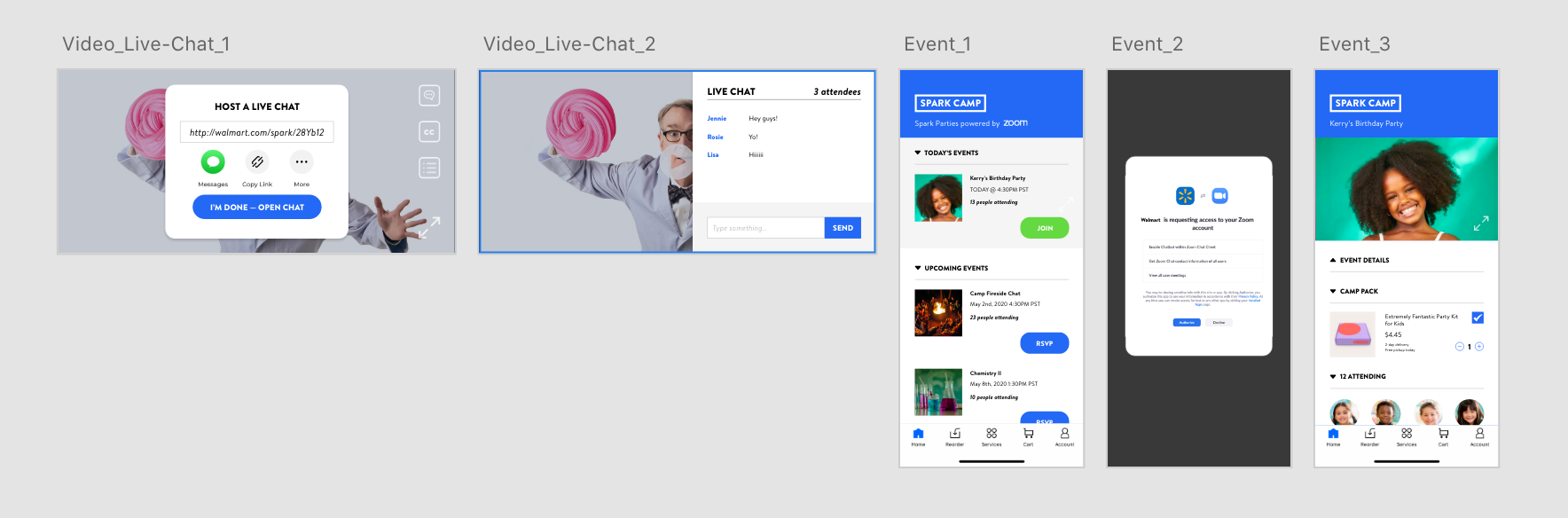
We explored additional features to go the extra mile for Walmart, working in Adobe XD to create wireframes.
Prototyping
I used Principle for prototyping this project because of its robust capability to prototype with interactive video. The main obstacle we faced was creating a prototype that could seamlessly transition from the standard vertical app view to a full screen view. This was particularly challenging due to the limitations of Principle, which cannot manipulate the orientation of your device. As a result, there were additional steps that needed to be taken in order to properly view the prototype in its intended state.
Camp Prototype for User Testing
User Testing
Due to constraints in time and budget, we opted to recruit internally at Deutsch, specifically targeting parents with young children. This approach proved to be beneficial as it allowed us to receive frequent and timely feedback, enabling us to iterate and enhance our work efficiently.
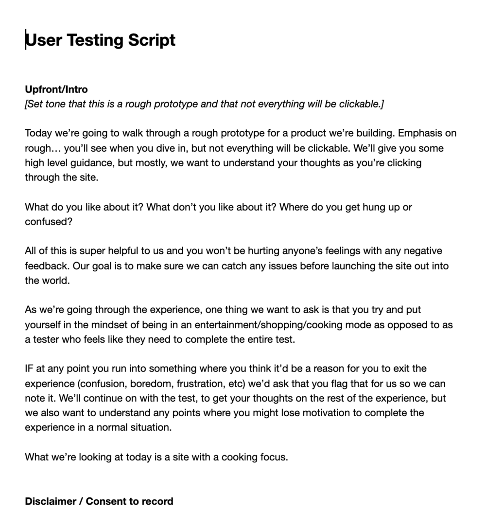 Example of User Testing Script
Process For User Testing
- Define and recruit target audience, whether with informal “cafe test subjects” or with a moderator/recruiting service.
- Create a dynamic, clickable prototype that is as close to the final product as possible. This includes copy and images.
- Write a user testing script beforehand, but improvise when needed.
- Record both the user’s face and prototype so that you can observe how they feel and what they are interacting with.
- Take notes on the fly and use a conversational approach. Most users are nervous about doing the “wrong” thing, so it’s always great to support them by saying “whatever you’re doing is the right thing!” or “if it seems broken, it’s our fault” and if the user seems frustrated, to prompt with “tell me how you’re feeling.”
- Don’t be flustered if the prototype is broken. The more the user knows it’s broken, the more frustrated they get.
- Adobe XD was the preferred prototyping software as you could make live updates to the prototype in between test sessions, and this allows you to troubleshoot any prototyping errors. I believe that it is more important to get the most realistic prototype out there than to worry about mistakes. Each test is precious, and when you start to get repetitive feedback, you’re not really capitalizing on the time you have with each tester. That being said, some things are better left tested as-is, and should be considered case-by-case.
User Testing Feedback
Three rounds of testing were conducted, unveiling the difficulties parents and children faced in the early stages of COVID-19. Parents required activities that children could independently engage in, surpassing mere entertainment. The notion of conveniently ordering supplies for such activities on a single platform appealed to them, with Walmart's vast inventory and accessibility at an affordable price.
The primary usability issue encountered was the format of "Activities" within each "Episode". Users were directed to a specific section of the interactive video when clicking on each "Activity", making it arduous to navigate around the Episode to various activities due to the non-linear nature of interactive videos. However, each activity had multiple configurations, such as "Making sock puppets", with examples including "Sock Puppet with Green Eyes" and "Sock Puppet with Red Eyes".
Eventually, "Activities" was removed from the interface, and "Activity" replaced the "Episode" nomenclature. This change was critical in defining the Camp's architecture, as "Activity" was unique to the Camp experience and "Recipe" was exclusive to the Cookshop experience (refer to Cookshop below).
Camp by Walmart
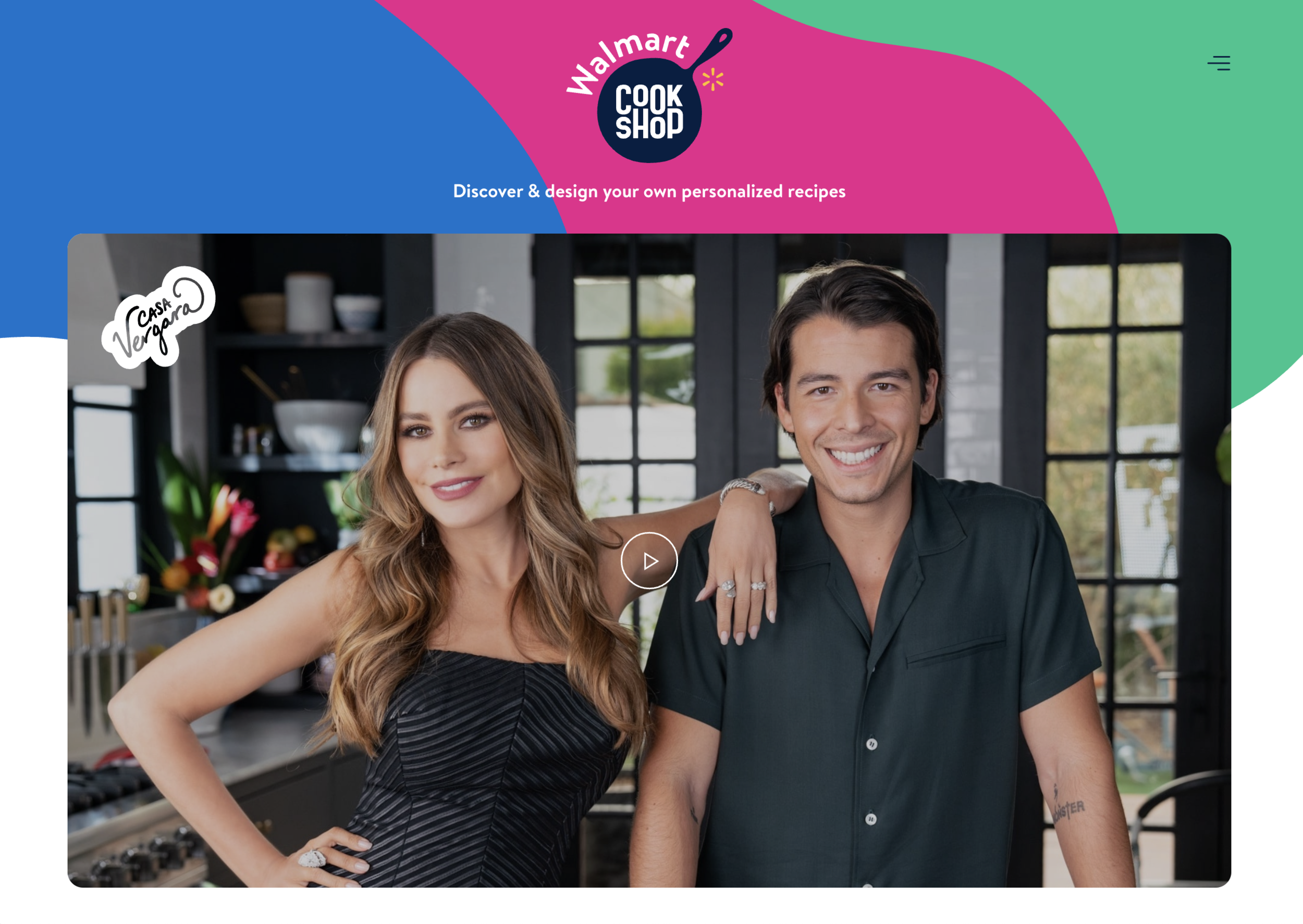
Cookshop by Walmart Desktop Site
Cookshop
Due to the success of Camp, we were able to launch a cooking-themed version of Camp. With learnings and data from Camp, Cookshop was the new and improved version of the platform.
In future iterations and rounds of testing, our challenge was to improve the usability of the ecommerce capabilities. Luckily, Walmart had updated the grocery section of their website to allow API access of their products. This was important as products differ by location, so a user must select a Walmart store in order to view the available products. We used a “drawer” component to provide users access to features like sharing, exploring more episodes, and exploring series. The drawer design was a great way to provide access to shoppable products.
Live Product Demos
Cookshop by Walmart - Casa Vergara