Taco Bell Delivery
Years
2021 - 2022
Role
Associate UX Director

Overview
I worked with Taco Bell on various projects over the course of 4 years as a Lead UX Designer. From 2021-2022 I lead a team of 6 designers in giving the app a facelift by way of introducing delivery into the app, which was powered by DoorDash. Using the DoorDash API allowed Taco Bell to launch delivery in the app quickly.
Through the concept process, we realized we would need to optimize the core features of the app in addition to net new features to successfully launch delivery to a nationwide market.
These features included
1. A launch screen to introduce delivery
2. A new global header to toggle from pickup to delivery and vice versa
3. A new delivery feature to input the user’s delivery address
4. A place to store saved delivery addresses
5. An updated checkout flow to include and validate delivery locations
With these new and optimized features, there were both experiential and technical requirements to consider. We created a high fidelity prototype using Adobe XD for user testing in order to gain further insight.
We used a combination of Zeplin and Google Slides to communicate user flows and features. Below are some examples of user flows that helped explain the nuances of our new designs.
Core User Flows
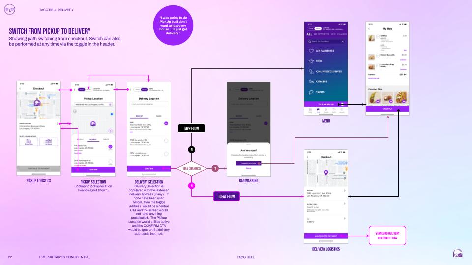
Switch from Pickup to Delivery
The pricing of Taco Bell's menu varies across its different locations, adding user experience and technical challenges to delivery integration. Our team collaborated with developers to devise a strategy that involves utilizing the DoorDash API. The DoorDash API would allow the app to choose the closest restaurant location in order to display accurate menu prices for your order, to accommodate varying prices across locations.
The pricing of Taco Bell's menu varies across its different locations, adding user experience and technical challenges to delivery integration. Our team collaborated with developers to devise a strategy that involves utilizing the DoorDash API. The DoorDash API would allow the app to choose the closest restaurant location in order to display accurate menu prices for your order, to accommodate varying prices across locations.
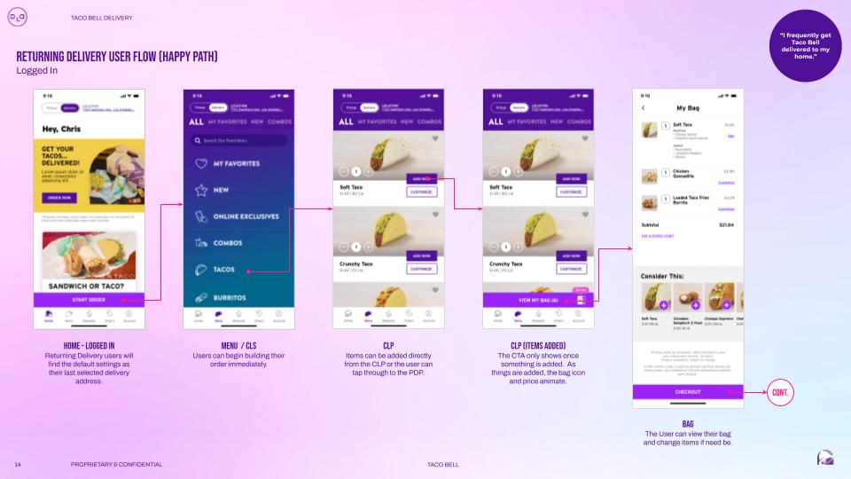
Returning Delivery Flow
Because the first time experience using Delivery requires a bit of user input, we wanted to make sure it paid off for returning users. We achieved this by ensuring their checkout process was fast and painless.
Because the first time experience using Delivery requires a bit of user input, we wanted to make sure it paid off for returning users. We achieved this by ensuring their checkout process was fast and painless.
User Testing
We conducted 2 days of user testing with 10 users, using a day in between to iterate upon feedback and validate the new designs. Each session was 75 minutes and conducted over Zoom.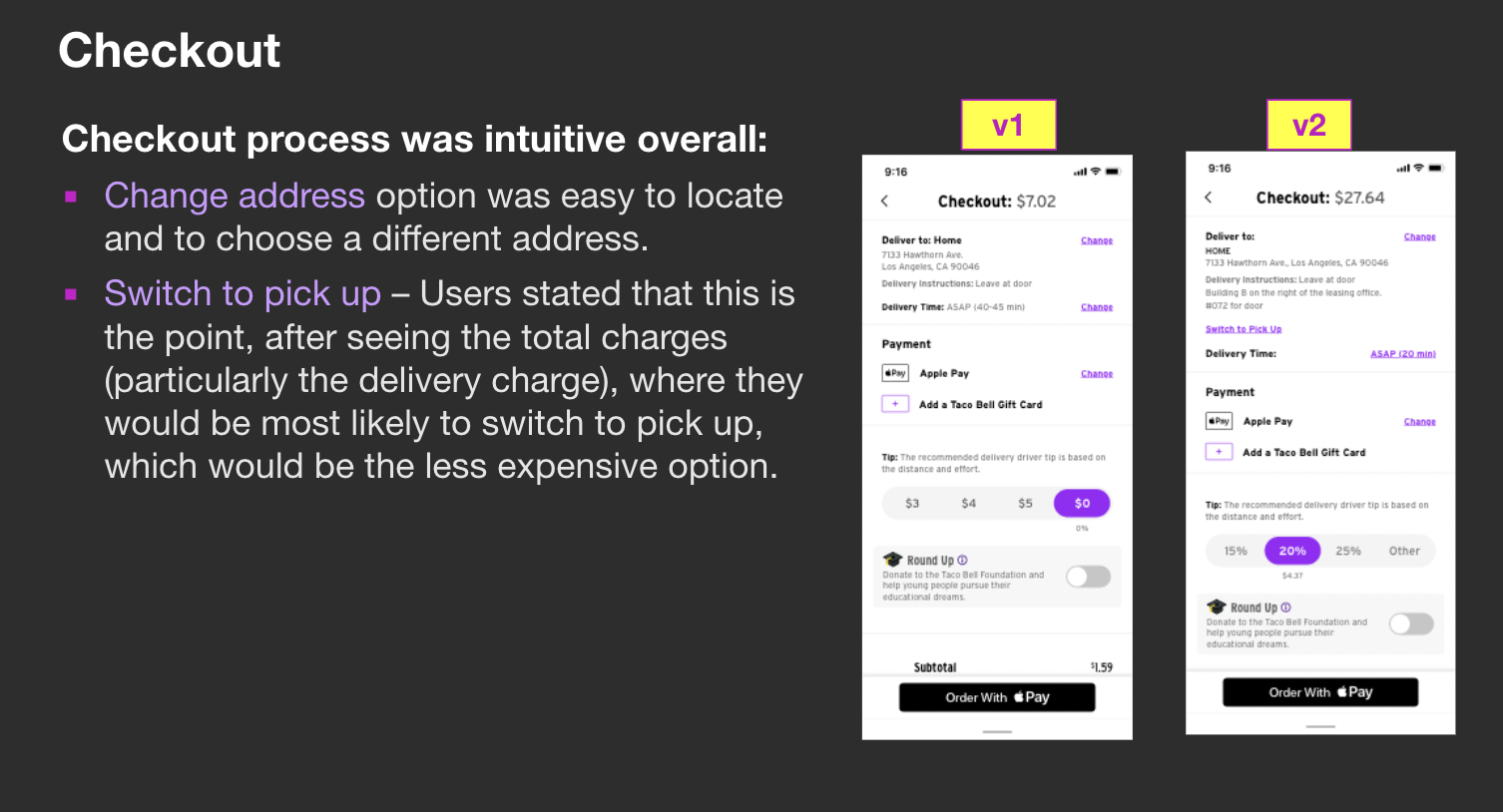
Sample analysis of qualitative feedback
Sample Insights
Due to the small sample size of testers, we use most, many and some to provide our clients a generalized understanding of user feedback.
- Many users swiftly navigated from the Home screen to the menu to place orders, especially if they already knew what they wanted to order.
- Some users inquired about the delivery driver's employer, leading to a conversation with Taco Bell about displaying the DoorDash logo. Notably, users expressed a great deal of concern about the drivers' pay in relation to the delivery fee.
- Most users felt the checkout process was intuitive, which was considered an improvement, as the performance of the checkout page had previously been problematic.
Motion
Taco Bell is recognized for incorporating “surprise and delight” elements into all aspects of their branding. When operating independently from other design teams, it can be challenging to uphold a unified vision. Delivery enabled us to incorporate liveliness through animation, and our talented visual designer, Thomas Rodgers, excelled in both illustration and motion design.
Thomas worked on dozens of iterations for the onboarding screen, the shopping “bag”, and the order tracker. I think this work really makes the Taco Bell app stand out from the competitive market of fast food apps.
PRESS
“This app has also come an incredibly long way—it was borderline unusable about two years ago.“
— Gizmodo